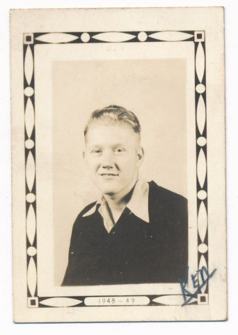
This one is a real mystery. I tried to do some searching for this fellow, but the name is apparently common enough that I was coming up with too many results and had too little information to really narrow things down and be sure I had the right person. I’m basically putting this out on the internet in case someone is searching for their ancestor and finds this post – if this is you, send me an update!
Grandma saved this letter from a man in France in 1950. She was 19 at the time, so this may have been a high school pen pal or letter exchange program? There’s not a lot of information here to really know for sure, but he sent her photos of himself and (presumably) his parents. Let’s start with the envelope.
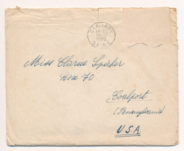
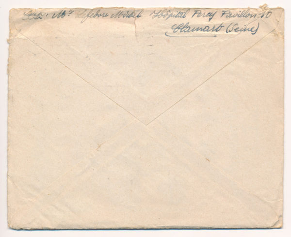
It’s addressed to Miss Clarice Spicher, and the postmark is from Clamart, Seine, France. The stamp has been cut out of the front. On the back, the return address is Mr. Lefebvre Michel, Hopital Percy, Pavilion 10, Clamart, Seine.
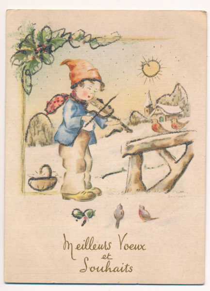
The front of the card features a boy playing a violin to little birds with a message, “Meilleurs voeux et Souhaits,” which Google Translate tells me says, “Many wishes and greetings,” in French.
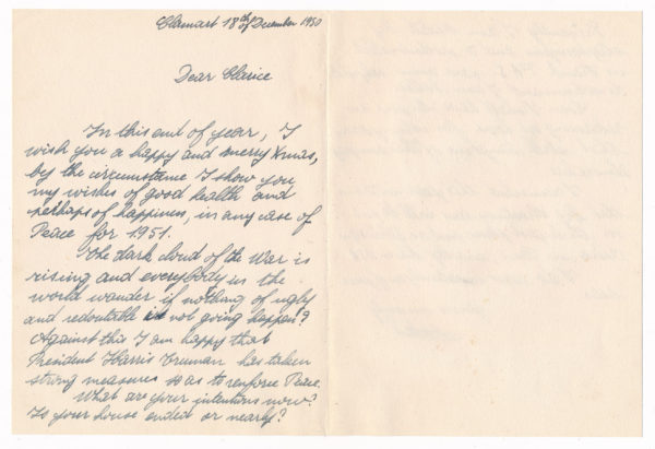
The inside message is dated at Clamart, 18 December 1950. Here’s a transcription to the best of my ability with the handwriting. I’ve left in misspellings and errors exactly as written.
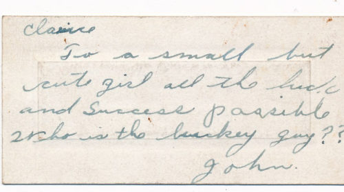
Dear Clarice,
In this end of year, I wish you a happy and merry xmas, by the circumstance I show you my wishes of good health and perhaps of happiness, in any case of Peace for 1951.
The dark cloud of the War is rising and everybody in the world wonder if nothing of ugly and redoutable is not going happen? Against that I am happy that President Harris Truman has taken strong measures so as to renforce Peace.
What are your intentions now? Is your house ended or nearly?
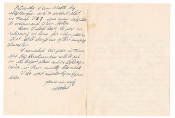
Presently I am treated by streptomycine and a product called in French P.A.S. para amino salyscilate di sodium and I am better.
Even I shall have the joy in returning at home for New Year, this shall change me of this annoying atmosphere.
I remarked this year in France that big Christmas-trees will be put on the largest places such as Obelisque Opera, in Paris, enactly like in U.S.A.
I do wait impatiently an of your letter.
Your Sincerely,
Michel
The drug he references seems to be a drug used to treat drug-resistant Tuberculosis, so it seems like our soldier was hospitalized and being treated for Tuberculosis when he wrote the letter.
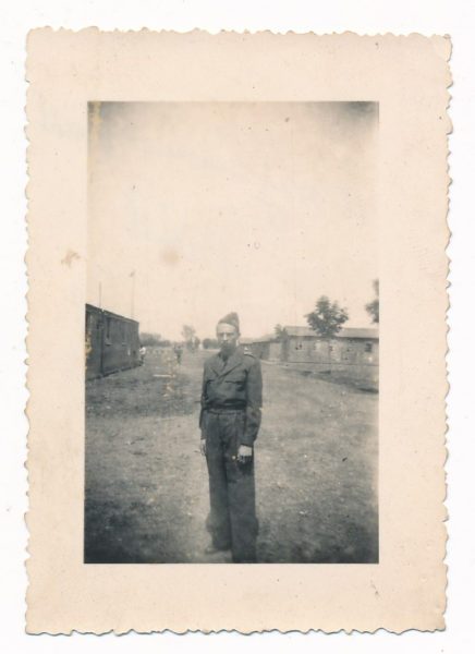
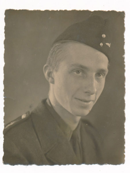
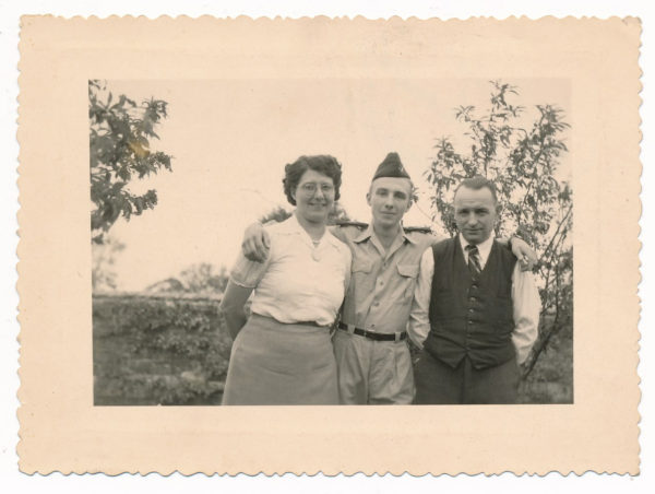
He also sent along three photos. The first is of him in uniform and what looks like barracks in the background, and the back inscribed with, “To my American friend, 1949.” The next is a more formal portrait, dated on the back 7 September 1949, and “to my friend Clarice.” And the last one I would imagine is of Michel and his parents, no date, but, “To my American and to our friendship.”
It’s a really neat capsule of a piece of correspondence and I’d love to know more about Michel if you happen to be connected to him! I’d imagine he was a young man, probably early 20s at the time this was sent.
UPDATE: It turns out there were more letters from this same man in her collection, so I’ve added those to other posts. They can be seen at the tag here: https://www.sheetar.com/tag/michel-lefebvre/