Tag: <span>holiday card</span>

Holiday Card 2023

This was the annual holiday card for 2023, and hopefully everyone has received theirs by now!  Lots of lessons learned on this one, and the screen and ink just didn’t cooperate with me, so this was frustrating, but the results are pretty great and hopefully don’t show how I very nearly scrapped this and didn’t even do a card this year.  There were four screen printing passes on this card – two for the front, one for the message inside, and one for the information on the back.  My husband had spent two years in Portsmouth, UK as an exchange officer with the Royal Fleet Auxiliary, and I got to visit a few times and see exactly this gorgeous view out of his apartment window.  The structure on the right is the Spinnaker Tower (wikipedia link) and the colorful sky in the background is the sunset that can be seen when it’s not raining (England, you know..).  I found out after printing that square cards require extra postage since the machines can’t tell which way is up – rectangles sort perfectly in their machines but squares get bumped out for hand stamping, so it was an extra 20 cents of postage.  Lesson learned folks, don’t send square cards.  The back is printed with a little info about the tower and husband’s work overseas, and my name and the date.  These went out REALLY late, so I put a more New Year’s style greeting inside.  I may play with this design later and do a linocut since I do love how it came out and I think it might lend itself better to a linocut, honestly!

Holiday Card 2022

This is the annual holiday card for December 2022, now that everyone has received theirs!  Every year, I put together a non-holiday-specific art card that works both as a greeting card to send holiday wishes to friends and family, and it functions as a way to flex some creative muscles and put together a little piece of functional art.  This year was a screen printed card with four color layers (yellow, green, gold, black) and an additional credit line on the back and a greeting line inside for a total of six passes of printing.  I was SUPER happy with how this came together and will likely use variations of this for the honey business this year.  For registration and to get the layers all lined up, I had printed out the design on cardstock and attached long tabs to the registration guide to line up each layer – you can see the little registration marks on the corners of the green screen below the card.  I also added 3 layers of painters tape in the corner of the registration guide to act as a sort of backstop to set each card every time so they’d all end up in the same place.  Is this the easiest way to do this?  Absolutely not.  Did it work pretty well and was cheaper than shelling out for registration pins and tabs?  DEFINITELY.  Was it perfect?  Not quite.  Anyway, so using that method, I first laid down the gold, then the yellow, then the green, and finally the black, leaving each layer to dry a couple of hours in between.  Wintertime low humidity meant it went pretty quick and I had the whole set of 43 (plus 12 test prints on cardstock) completed in two days.  I printed them on a bunch of blank cards I had picked up when AC Moore closed a few years ago, so I had a stash of kraft brown and plain white at my disposal. Not sure which I like best, to be honest!  The paper didn’t mesh super well with the ink and there’s some weird bleeding that didn’t happen on the plain cardstock tests, but I think the white paper has some shiny coating on it that makes it a little fussy.  In the end, I was REALLY pleased with the design and how they came out, and I hope the recipients enjoyed them as well!

Holiday Card 2021

Now that they’ve all arrived at their destinations, I can finally show off the holiday art card I made for 2021!  I’m not too big on the winter holiday season – I’m not religious, I don’t really celebrate any sort of traditional Christmas or religious holiday, and have found it hard to find happiness during this time of year – I’m pretty deeply introverted, so large parties are not my thing, and feeling guilty for not being happy during that time of year is difficult to deal with when everyone has these high expectations and standards of how/when/where/why you should be happy and celebratory.  For the past I think 4 years now, I’ve gotten into the habit of making a not-holiday-specific art card instead of buying pre-made cards as a way of giving myself a creative challenge and finding my own way to something happy without following a cookie-cutter mold of how things should be.  It also fits in with my idea that the winter holiday season should be more about the people and the gathering rather than the stuff and the things, so creating something with my own two hands feels more meaningful and less wasteful than buying stuff that might end up being returned, sold, traded, re-gifted, etc.  Being together in person with the pandemic and all has been difficult, so this sort of fills in that gap a little too by having something handmade to send to family and friends.

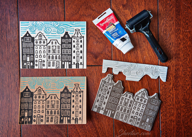
On to the card!  After last year’s complicated 3 layer screen print, I went a little simpler this year with a two piece linocut of the canal houses in Amsterdam.  I sort of took ideas from houses I’d photographed while traveling and various photos around the internet and mashed them together into this.  Then, once I saw the empty space above just the houses, I took the scrap cut from the houses and made a little windy sky to fill that space.  I used a batch of cards I picked up in bulk when AC Moore closed (I’ll be using those for years to come) and printed with black Speedball Fabric Ink in black as well as a standard Speedball Block Printing Ink (water based) in a light blue color.  The block itself isn’t even real linoleum, it’s a rubber “Soft-Kut” printmakers block that I get in 12×12″ pieces and then cut down to fit each project.  The rubber is like sneaker sole material and is easier to carve and definitely a lot less hard on the carving tools, though it can be a bit less exact, especially on corners and edges since it smooshes and squishes with the tools.  Proper lino is a nice, hard surface and definitely gives me better lines, but it’s more difficult to cut and work with and can sometimes crumble.  As for the ink, I like working with the oil-based fabric ink much better, but didn’t happen to have the blue color on hand in the same ink, so I used the classic water-soluble ink for the sky bits.  The water-soluble ink tends to leave a texture behind, but dries immediately while the oil-based ink prints cleaner and flatter, but takes a few days to dry completely.

Overall, I really liked this year’s card!  I did put together a screen for the inside message, “From our home to yours,” and the back of the card for the date and credit lines, so it’s all hand printed between the linocut and the screen print, no printer printing.  Now I’ve got to start thinking about next year’s card at some point!