Tag: <span>screen printing</span>

Holiday Card 2023

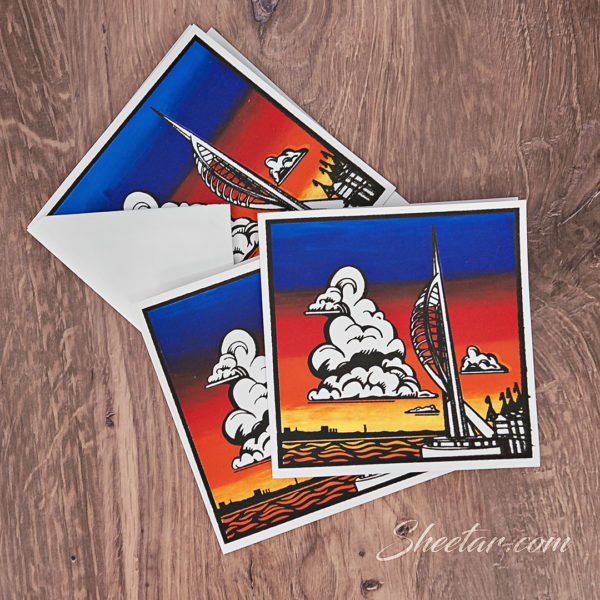
This was the annual holiday card for 2023, and hopefully everyone has received theirs by now!  Lots of lessons learned on this one, and the screen and ink just didn’t cooperate with me, so this was frustrating, but the results are pretty great and hopefully don’t show how I very nearly scrapped this and didn’t even do a card this year.  There were four screen printing passes on this card – two for the front, one for the message inside, and one for the information on the back.  My husband had spent two years in Portsmouth, UK as an exchange officer with the Royal Fleet Auxiliary, and I got to visit a few times and see exactly this gorgeous view out of his apartment window.  The structure on the right is the Spinnaker Tower (wikipedia link) and the colorful sky in the background is the sunset that can be seen when it’s not raining (England, you know..).  I found out after printing that square cards require extra postage since the machines can’t tell which way is up – rectangles sort perfectly in their machines but squares get bumped out for hand stamping, so it was an extra 20 cents of postage.  Lesson learned folks, don’t send square cards.  The back is printed with a little info about the tower and husband’s work overseas, and my name and the date.  These went out REALLY late, so I put a more New Year’s style greeting inside.  I may play with this design later and do a linocut since I do love how it came out and I think it might lend itself better to a linocut, honestly!

Holiday Card 2022

This is the annual holiday card for December 2022, now that everyone has received theirs!  Every year, I put together a non-holiday-specific art card that works both as a greeting card to send holiday wishes to friends and family, and it functions as a way to flex some creative muscles and put together a little piece of functional art.  This year was a screen printed card with four color layers (yellow, green, gold, black) and an additional credit line on the back and a greeting line inside for a total of six passes of printing.  I was SUPER happy with how this came together and will likely use variations of this for the honey business this year.  For registration and to get the layers all lined up, I had printed out the design on cardstock and attached long tabs to the registration guide to line up each layer – you can see the little registration marks on the corners of the green screen below the card.  I also added 3 layers of painters tape in the corner of the registration guide to act as a sort of backstop to set each card every time so they’d all end up in the same place.  Is this the easiest way to do this?  Absolutely not.  Did it work pretty well and was cheaper than shelling out for registration pins and tabs?  DEFINITELY.  Was it perfect?  Not quite.  Anyway, so using that method, I first laid down the gold, then the yellow, then the green, and finally the black, leaving each layer to dry a couple of hours in between.  Wintertime low humidity meant it went pretty quick and I had the whole set of 43 (plus 12 test prints on cardstock) completed in two days.  I printed them on a bunch of blank cards I had picked up when AC Moore closed a few years ago, so I had a stash of kraft brown and plain white at my disposal. Not sure which I like best, to be honest!  The paper didn’t mesh super well with the ink and there’s some weird bleeding that didn’t happen on the plain cardstock tests, but I think the white paper has some shiny coating on it that makes it a little fussy.  In the end, I was REALLY pleased with the design and how they came out, and I hope the recipients enjoyed them as well!